Sprytelabs
Solutions
About
INDUSTRY
FINANCE
Equities, Trading, FE to BE systems
MARKETING
Manage modern digital marketing with ease
BROWSE ALL INDUSTRIES
See all our available Industries
View Documentation
Start learning about what Spryte has to offer

Client
Description
WorkWell helps organizations prevent and treat sprains, strains, and back pain by delivering comprehensive and scalable musculoskeletal health programs as part of their overall safety and wellness programs. The Company partners with employers to keep employees safe, healthy, and productive by identifying workplace risks, implementing early intervention and proactive ergonomics, providing employee testing and treatment, and ensuring safety compliance. WorkWell has trained more than 10,000 highly educated credentialed PT/OT providers on their industry-leading workplace methodologies.
Challenge
WorkWell came to us to refresh their brand and their website. The new CEO saw an opportunity to create a more impactful online presence that's better aligned with the Company's industry leadership and innovative, resilient spirit. WorkWell's website speaks to two audiences, enterprises and PT/OT practitioners looking for additional training. The new website needed to make that distinction clearer. The goal for the new website is to provide customers and visitors with an easier way to learn about WorkWell's services and programs. The Company wanted to modernize the look and feel, make it easier to navigate, more user-friendly, and guide visitors to helpful information. The Company wanted its visual identity to have a modern look to reflect who they are today and symbolize their dynamic future. The Company had a fragmented tech stack that didn't provide visibility throughout the customer buying journey - WordPress, Pardot, Mail Chimp, and Salesforce. The competition had already modernized its brand and digital assets. Last, WorkWell wanted to partner with an agency that could help fuel growth
Solution
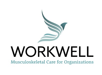
We worked closely with the WorkWell team to revamp their messaging and value propositions. The old website strictly focused on an ROI message that didn't resonate strongly with their primary personas – EH&S management, HR, and Risk Management. We re-crafted their messages and value propositions to engage primarily with the decision-maker - EH&S, with HR and Risk Management as secondary targeted personas. After several creative iterations, WorkWell chose the phoenix because it is a symbol of hope and safety. The new logo symbolizes safety and caring, reflecting their mission to help companies create a world-class safety culture by managing their most valued assets - their employees. The phoenix's upward motion is a visual representation of the importance of treating employees throughout their entire employment journey - before, during, and post-employment as they transcend to future success. The phoenix also symbolizes knowledge and communication. WorkWell's industry-leading provider training keeps our PTs/OTs informed and educated so that they deliver the best outcomes for their clients. The phoenix also symbolizes overcoming adversity. Being able to move without pain is critical to an individual's productivity and livelihood. WorkWell's musculoskeletal wellness solutions are a vital component of any world-class safety program and contribute significantly to employees' productivity, health, and wellbeing by reducing risk, boosting morale, and creating employee trust. We recommended Hubspot's CMS, CRM, and Marketing Hub to unify the tech stack. According to Hubspot, customers who use both Marketing Hub and CMS Hub together see 121% more contacts (leads) generated than those who use a single hub.